Resume Fonts & Design That Impress in 2026 (Without Breaking ATS Rules)
Discover the best fonts and design tips for resumes in 2026. Learn how to choose fonts that look professional, pass ATS scans, and make your resume stand out.


Updated Mar 20, 2026
Read
14 min

Why Font and Design Matter More Than Ever
Your resume design makes an impression before a recruiter even reads a word. The font, spacing, and layout all affect how polished and professional it feels.
But design isn't just about aesthetics — it's also a functional decision. Most companies today use Applicant Tracking Systems (ATS) to filter resumes before a human ever sees them. These systems parse your text, extract your job titles, skills, and dates — and rank you against other candidates. A resume that looks beautiful but uses text boxes, graphics, or unusual fonts can fail at this stage entirely. Not because of your experience, but because the software couldn't read it.
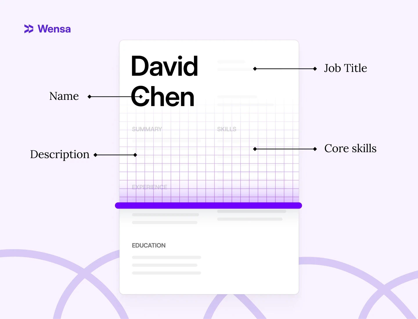
At the same time, design that's too plain can hurt you in a different way. When a recruiter does open your resume — often after dozens of others — a wall of unformatted text with no visual hierarchy makes it harder to find what matters. Eye-tracking research shows recruiters spend an average of 6–7 seconds on an initial resume scan. In that window, your name, job title, and two or three key achievements need to register immediately. The right font, the right spacing, and a clear layout make that possible.
Font and design decisions aren't cosmetic — they directly affect whether your resume gets read at all, and whether it makes the right impression when it does.
Pro Tip: A beautiful resume that an ATS can’t read is as bad as a plain one that’s hard to look at. The best designs find that sweet spot — clear, consistent, and completely compatible.
What Font Is Best for Resumes in 2026?
The best fonts are simple, modern, and easy on the eyes. Avoid fancy fonts. They can break while processing, making your resume look messy on various screens.
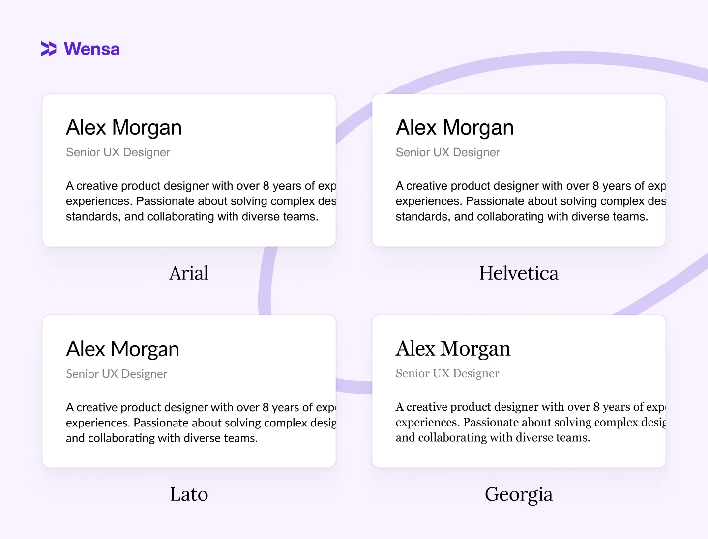
Here are top-performing fonts in 2026:
Calibri – Clean, modern, and recruiter-approved
Arial – Simple, universal, and great for screens
Helvetica – Sleek and professional, ideal for creative fields
Lato – Minimal but warm; great for digital readability
Georgia – A classic serif font that adds subtle personality
Skip decorative or script fonts like Comic Sans, Papyrus, or Brush Script. They look unprofessional and often cause formatting issues when uploaded.
Pro Tip: Always test your resume in both PDF and Word. Fonts can shift slightly between platforms.
For more on formatting, check out PDF vs Word Resume: Which Format Is Best for Job Applications in 2025?
Serif vs. Sans-Serif: Which Is Right for Your Resume?
Not all fonts are built the same — and the difference between serif and sans-serif matters more than most job seekers realize.
Serif fonts have small decorative strokes at the ends of letters. Think Georgia, Garamond, or Times New Roman. They feel traditional, authoritative, and polished — which is why they've been the standard in law, finance, and academia for decades.
Sans-serif fonts have clean, undecorated edges. Think Calibri, Arial, or Lato. They look modern, minimal, and screen-friendly — which makes them the go-to choice for tech, marketing, and most corporate roles today.
Serif | Sans-Serif | |
|---|---|---|
Examples | Georgia, Garamond | Calibri, Arial, Lato |
Best for | Law, Finance, Academia | Tech, Marketing, Business |
ATS compatibility | Good | Excellent |
Feel | Traditional, authoritative | Modern, clean |
Which should you choose? For most industries in 2026, sans-serif is the safer default — it reads well on screen and passes ATS consistently. Serif works well if you're applying to more traditional fields where a formal, classic look is expected.
Best Resume Fonts by Industry (2026 Guide)
The "best" font depends on where you're applying. Here's what works by field:
Tech & Engineering Calibri, Arial, or Lato. Clean and modern — matches the culture of most tech companies. Avoid anything decorative. Recruiters in this space scan fast; readability beats personality. See how clean formatting looks in a real example: Software Engineer Resume Example.
Finance & Law Georgia or Garamond. These fields value formality and precision. A serif font signals that you understand professional norms — which matters when first impressions carry real weight.
Marketing, Design & Creative Helvetica or Lato. You have slightly more room to show personality, but restraint still wins. One clean font with intentional spacing looks more skilled than an over-designed resume that's hard to read. For inspiration on layout and tone: Digital Marketing Resume Example.
Healthcare & Education Calibri or Georgia. Both project calm professionalism. Avoid anything trendy or editorial — the tone should match the role.
The universal rule: if you're unsure about your industry, Calibri 11pt or Arial 11pt will never work against you.
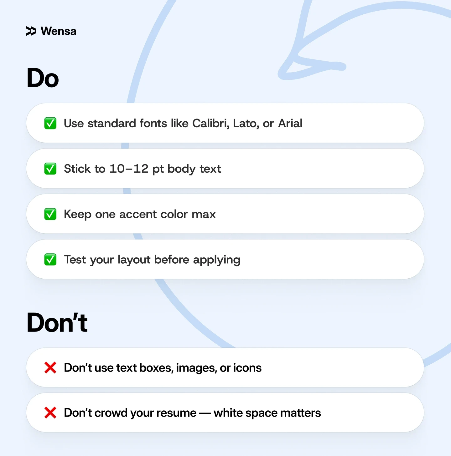
Resume Design Tips That Still Pass ATS
1. Keep the Layout Simple
Avoid graphics, icons, or multiple columns. ATS software processes text linearly — top to bottom, left to right. When you use a two-column layout, the system often reads across both columns simultaneously, creating jumbled output. A recruiter reviewing the parsed version of your resume sees something unreadable and moves on.
Stick with one column, clear headings, and bullet points. It's not limiting — it's the format that lets your actual experience do the work.
2. Use Consistent Font Sizes
Name: 16–18 pt
Section headings: 12–14 pt
Body text: 10–12 pt
This hierarchy guides the recruiter's eye to the most important information first, and signals that you pay attention to detail. Inconsistent sizing — even by just 1–2pt in random places — creates a subtle sense of disorder that's hard to explain but easy to feel.
3. Limit Your Colors
Stick with one accent color — navy, charcoal, or forest green are safe choices that read as professional across industries. If you work in a creative field, a slightly bolder tone (deep teal, burgundy) can work — but test it first by printing the resume in black and white. If the structure still reads clearly without the color, you're fine. If it falls apart, the color is doing too much work.
Avoid bright or neon colors entirely — they can display differently on various screens, and if your resume gets printed in grayscale, a bright yellow accent disappears completely.
4. Add Breathing Room
White space — the empty areas between sections, around text, and in your margins — is one of the most underused design tools on a resume. When a resume feels cramped, recruiters unconsciously associate that density with difficulty.
Aim for margins of at least 0.5 inches on all sides (0.75–1 inch is ideal). Don't try to squeeze everything onto one page by shrinking spacing. If your content genuinely needs a second page, use it — a two-page resume with good spacing reads better than a one-page resume that looks like it's trying to escape its borders.
5. Test Before You Send
Open your resume on a phone, tablet, and laptop. Fonts, spacing, and alignment can shift between devices, operating systems, and PDF viewers. Three quick checks before every application:
Screen test — open the PDF on your phone. Does it still look clean at a small size?
Text test — paste the content into a plain .txt file. Does all the information appear in the right order?
Print test — print one copy. Spacing issues that are invisible on screen often appear immediately on paper.
If all three pass, your resume is ready to send.
Pro Tip: Print it once. If it looks off on paper, it probably needs a tweak digitally too.
Resume Templates: Helpful or Risky?
Templates can save you time, but not all are ATS-friendly. Many Canva or Photoshop designs look great but can break when scanned.
Always export a plain text version for online applications if you use a creative template.
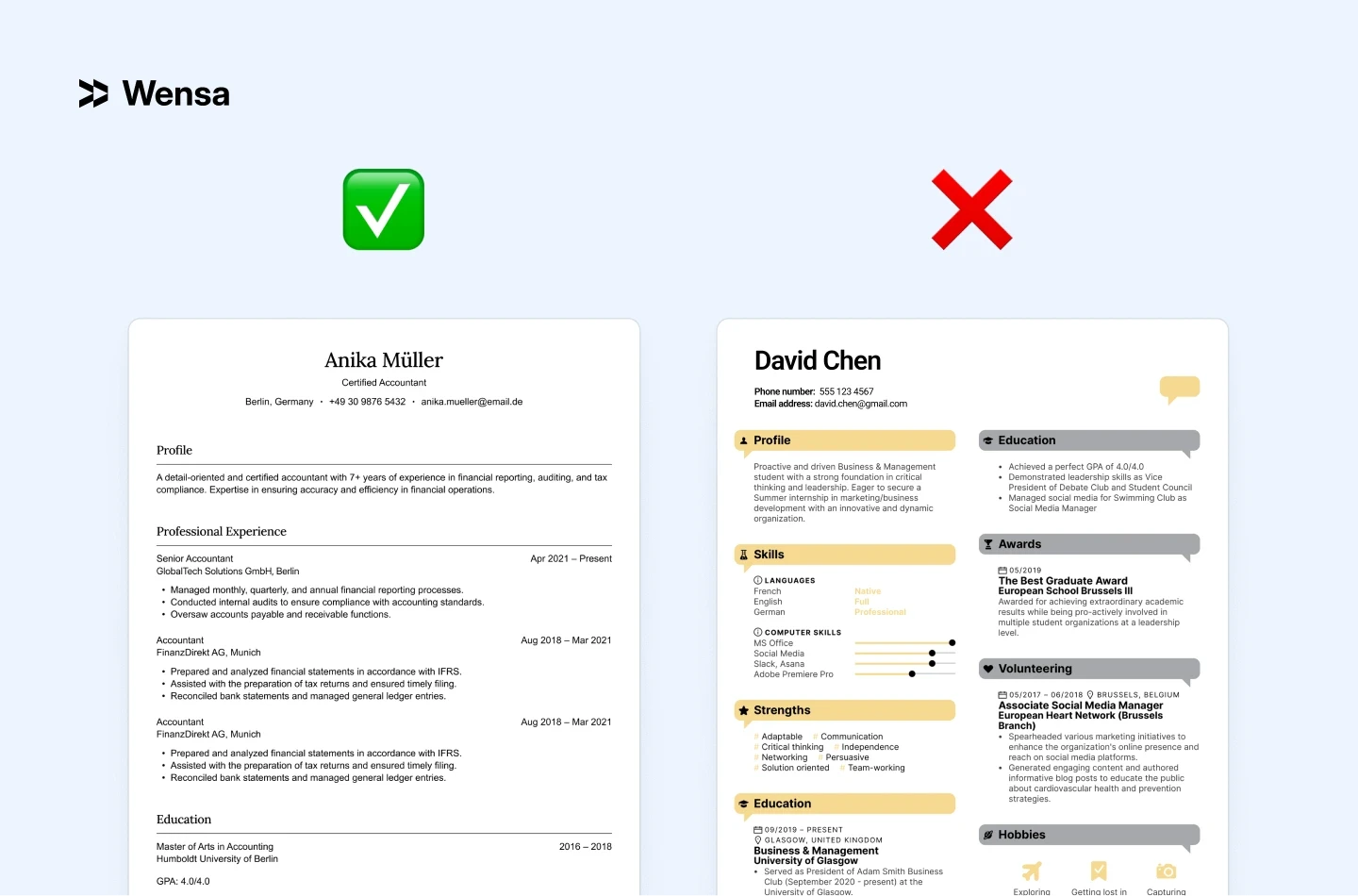
A graphic designer picked a colorful template with layered text boxes. It looked amazing as a PDF, but it didn’t work for online uploads. When she used a clean, ATS-safe template to rebuild it, she got responses right away.
If you prefer templates, choose one designed for ATS compatibility. Browse our professional resume templates — all built with ATS-safe formatting by default.
For good options, check out Best Resume Builders in 2026 (Tried, Tested & Ranked for Every Job Type). It shows tools that mix creativity with compliance.
Pro Tip: Think of design as a supporting role. It should highlight your experience — not steal the spotlight.
Do Resume Designs Affect ATS Readability?
Absolutely. ATS systems can’t read what they can’t see. They scan plain text — not images, icons, or shapes.
If your resume has text in graphics or images, key details like job titles and skills may go unseen.
Example: One applicant embedded his contact info in a header graphic. The ATS couldn’t detect his email or phone number, and his application was rejected before anyone saw it.
Fix it: Keep text simple, standard, and selectable. Avoid embedding text into shapes or images. If you want a head start, our ATS-friendly resume templates are built to pass every major system.
To dive deeper, check out ATS Resume Tips: How to Make Sure Your Resume Passes in 2026 for a quick checklist.
Quick Checklist: Font & Design Dos and Don’ts
FAQ — Resume Fonts & Design in 2026
What is the best font for a resume in 2026?
Calibri, Lato, and Arial are the top choices for most job seekers. They're modern, ATS-safe, and easy to read on screen. If you're applying to law or finance, Georgia or Garamond are strong alternatives with a more formal tone.
What font size should I use on a resume?
Use 10–11pt for body text, 12–14pt for section headings, and 16–18pt for your name at the top. This hierarchy makes your resume easy to scan — recruiters spend an average of 6–7 seconds on a first read.
Is Times New Roman still acceptable for resumes?
It's not wrong, but it's dated. Times New Roman was the default for decades, but most recruiters now associate it with old-format resumes. Switching to Georgia (if you want serif) or Calibri (if you want modern) gives you the same formality without looking outdated.
Can I use two fonts on one resume?
Yes — but only if they serve different purposes. A common approach: one sans-serif font for body text (Calibri, Lato) and one serif for your name or headings (Georgia). More than two fonts almost always looks cluttered.
What fonts should I avoid on a resume?
Avoid Comic Sans, Papyrus, Brush Script, and any script or display font. Also avoid fonts that render inconsistently across operating systems — Cambria and Century Gothic can shift layouts when opened on a different device.
What font is best for passing ATS?
Sans-serif fonts like Calibri, Arial, and Lato have the most consistent ATS performance. The safest move: export your resume as a PDF using one of these, then paste the text into a plain text file to verify everything reads correctly. For a full checklist, see ATS Resume Tips: How to Pass Every System in 2026.
Does font choice affect how ATS scores my resume?
Not directly — ATS doesn't grade fonts. But a font that causes formatting errors (broken characters, merged words, unreadable text boxes) can cause your resume to score lower because key information doesn't parse correctly. Clean fonts eliminate that risk entirely.
How do I know if my resume font looks professional?
Send the PDF to yourself and open it on a phone. If it reads clearly at a small size without zooming, the font is working. If anything feels cramped, heavy, or decorative — simplify. Printing one copy also helps: layout issues that are invisible on screen often appear immediately on paper.
Conclusion — Simplicity Wins in 2026
The best resumes in 2026 are clean, modern, and effortless to read. Great design isn’t about flash — it’s about function. Choosing the right font and layout helps your resume feel polished and pass the ATS test.

Ready to elevate your resume? Start using Wensa’s Resume Builder today and see the difference. It employs smart design principles and ATS-friendly formatting by default. So, your resume always looks sharp and scans well.
For more expert advice, check out Top Resume Mistakes to Avoid in 2026 (And How to Fix Them).
Teanca Holt is a recruiting expert and digital content writer from Utah with over five years of experience helping people craft resumes that get noticed. At Wensa, she shares practical tips on writing, career growth, and landing the job you want.


